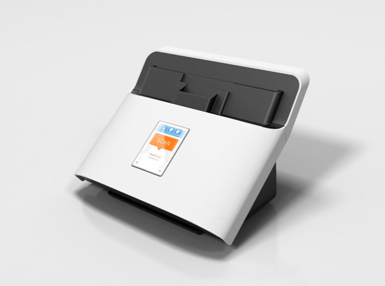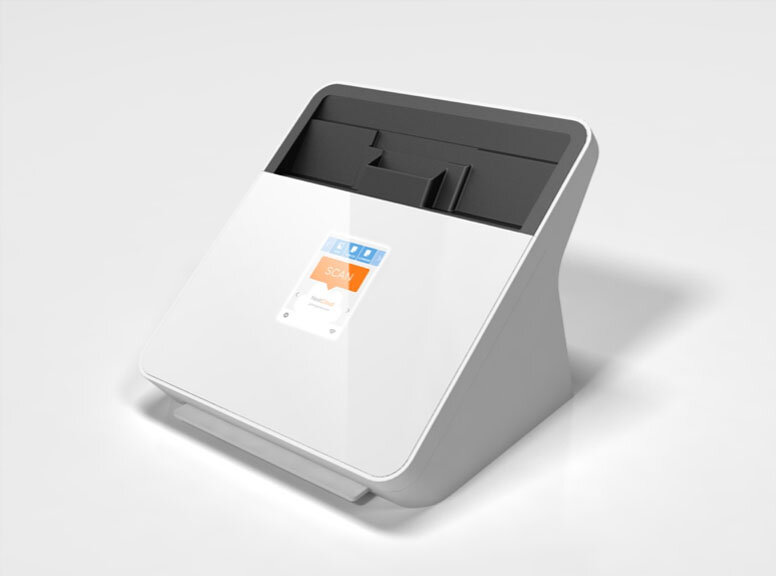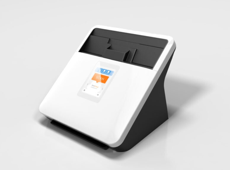

After moving their digital filing system to a subscription cloud service, Neat wanted to add a scanner that could skip the desktop software altogether – and scan directly to the cloud.
Neat’s hardware, software, and cloud ecosystem transforms receipts, business cards, and other documents into actionable digital data formats. The idea is to eliminate paper clutter, and extract the key data - which can then be easily searched or imported to other software – such as Quickbooks (receipts and invoices) – or turned into contacts (business cards).
As part of developing the initial cloud offering, we conducted extensive in-home research to understand the real-world workflows and challenges users had scanning and organizing their documents.
Over and over we saw well-intentioned users with piles of documents still waiting to be scanned. People would toss receipts and other documents on their desks as they came in, and when they had time, they would scan everything in.
What we realized was that the process of sitting down at the computer, launching the software, scanning something and then organizing the resulting digital file seems like too much work to do for every piece of paper that comes in. So, folks wait until there's a pile worthy of such a dedicated undertaking. Of course, the larger the pile gets, the more of an undertaking it is – which brings us back to the piles of unscanned paper we kept seeing.
Our insight was to separate the task of scanning from the tasks of reviewing and organizing – and to make it no harder to put the paper in the scanner than in a pile next to it.


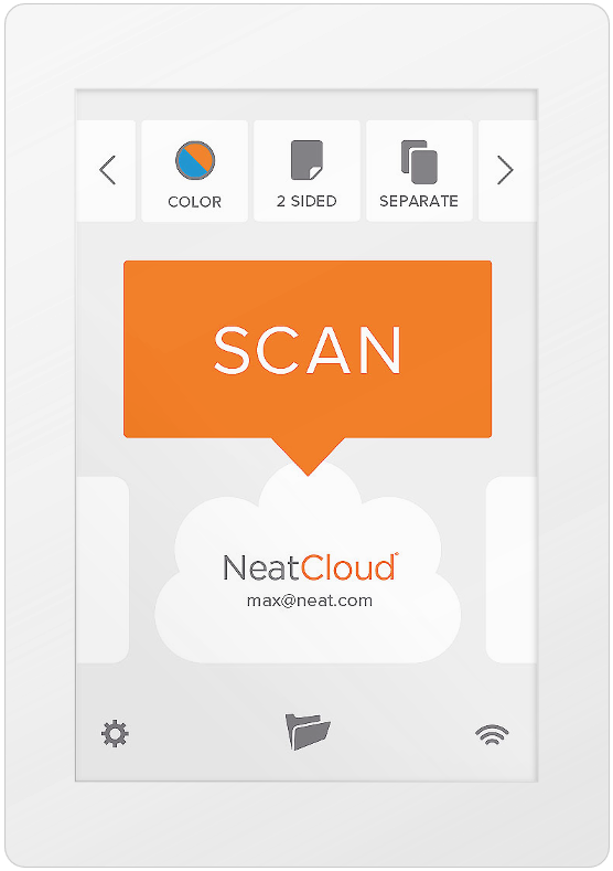
We knew that to achieve this we'd have to cut the computer out of the equation, and provide a simplified interface on the device.
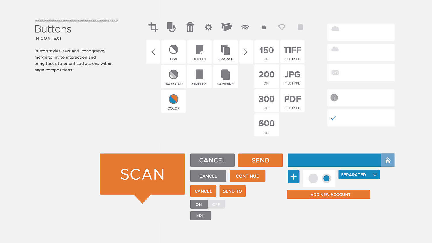
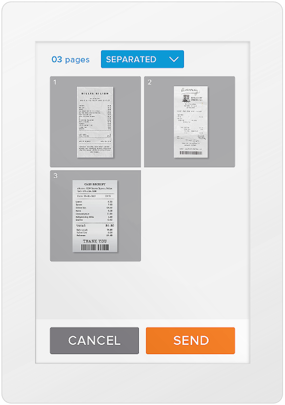
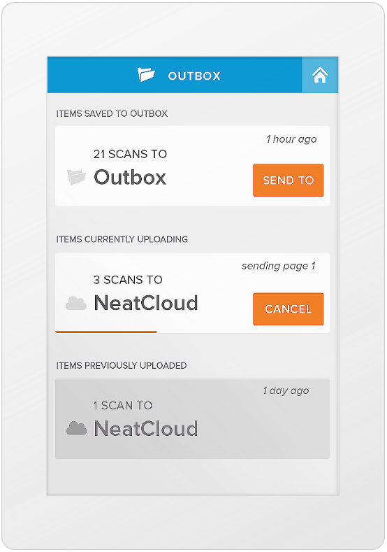
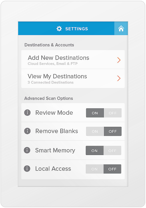
User feedback guided prioritization of controls and features to include – selecting a cloud destination, color and output format settings, and simple review of scans with basic crop and rotate controls.
We partnered with Frog and got started with preliminary concepts for hardware and interaction design. As Director of Product Design & UX at Neat, my job was to oversee and guide this work to ensure it met our users needs and was consistent with our overarching brand experience.
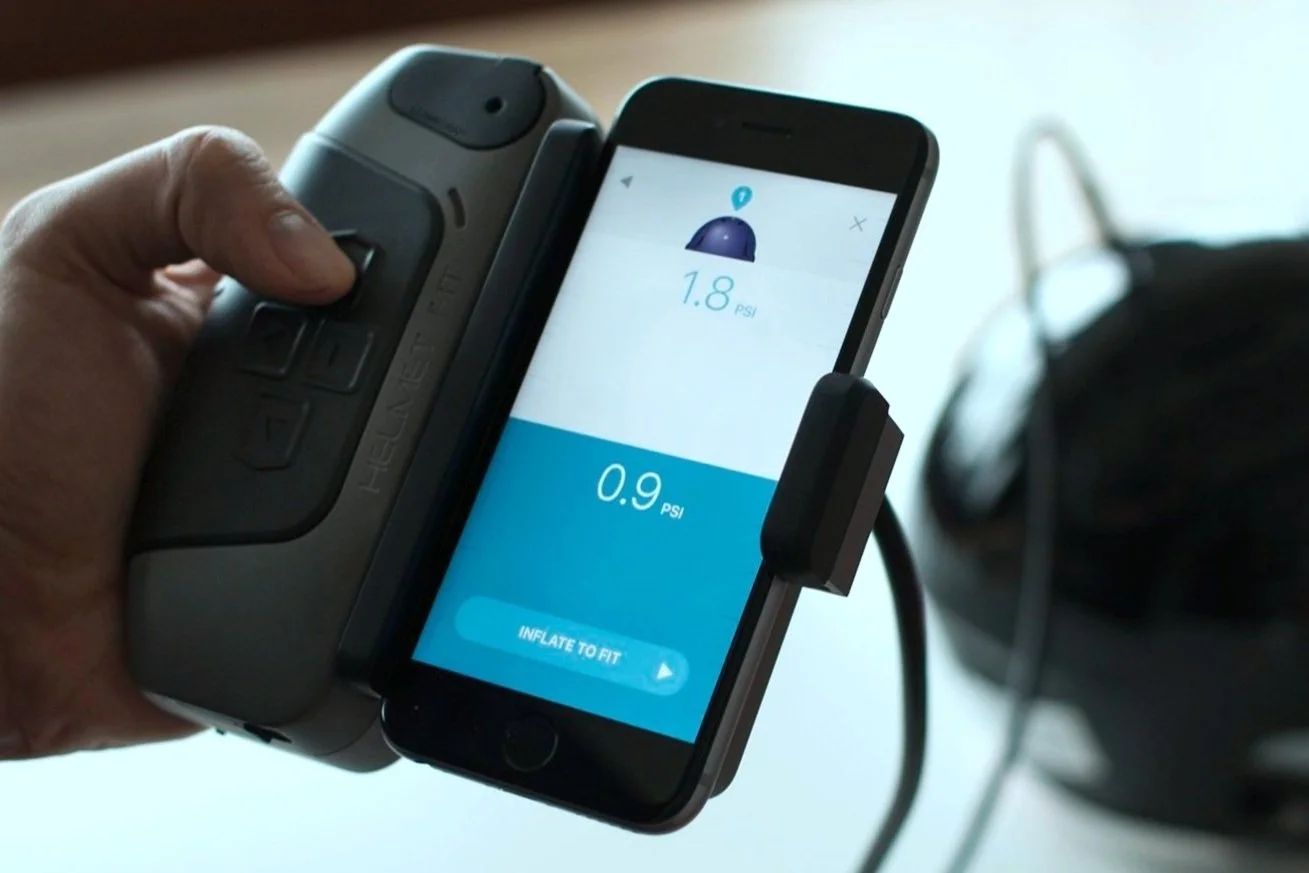
We built a physical prototype with a compartment to house an iphone (running an interactive prototype) to test usability of the device and workflows.
Our first pass at onboarding screens highlighted various functions and controls, with text explaining functionality. We found that users weren't recalling that information once they started scanning.
We reimagined onboarding as part of the process of doing your first scan, walking users through each step as they went along.
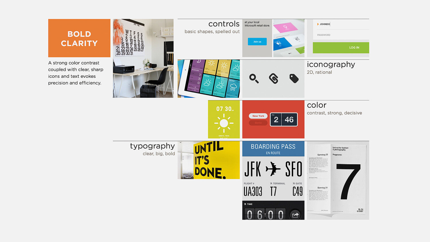
We overhauled the visual language across the ecosystem to align with the bold, crisp design system we introduced with NeatConnect.
We also harmonized product onboarding to ensure a consistent experience regardless of entry point, with particular attention to the NeatConnect OOBE and layered educational content emailed to customers at key points post-purchase.
“Neat did a terrific job with the setup and getting started process. Everything, from the box’s packaging - with its neatly labeled components inside - to the setup wizard offered a good user experience.”


